Simplifying agri-commerce for small and big farmers through intuitive digital tools. Helping buyers discover verified produce with confidence and clarity.
View live prototypeFAARMS™ is a modern digital platform built to serve the everyday needs of farmers. It provides a one-stop solution offering a full range of agricultural products and services - including seeds, fertilizers, pesticides, animal feed, and more - all delivered directly to the farmer’s doorstep.
Designed to simplify access and improve convenience, FAARMS™ brings essential farm inputs into a single, easy-to-use digital experience, helping farmers save time, reduce effort, and make better purchasing decisions.
India’s agricultural supply chain is highly fragmented, making it difficult for farmers-especially those in remote and rural regions-to access reliable agri-inputs at fair prices. In 2020, many farmers were still unfamiliar with using mobile applications and depended heavily on local markets for purchasing seeds, fertilizers, and pesticides. These local options often had limited stock, inconsistent pricing, and no assurance of product authenticity, resulting in poor crop performance and reduced income.
FAARMS™ was created to bridge this gap by bringing essential agricultural products and services onto a single digital platform. By simplifying product discovery, ensuring verified suppliers, and enabling doorstep delivery, FAARMS™ aims to modernize the way farmers procure inputs, improve crop outcomes, and make trustworthy purchasing decisions with confidence.
Business Goals: FAARMS™ aims to digitize the agri-input buying process by giving farmers a simple, trustworthy platform to access quality seeds, fertilizers, and essential products. The goal is to expand market reach, increase conversions through transparent pricing and easy discovery, and reduce reliance on local intermediaries. By ensuring reliable delivery, verified suppliers, and personalized recommendations, FAARMS™ focuses on building long-term loyalty and creating a smoother, more dependable buying experience for farmers across all regions.
User Goals: Farmers want a simple and reliable way to find and purchase genuine agri-inputs-such as seeds, fertilizers, pesticides, and animal feed-without depending on local shops with limited choices. They aim to compare prices, understand product quality, and buy from verified suppliers they can trust. Users also look to save time through doorstep delivery, receive clear guidance while using the app, and stay updated on order status and product availability. Most importantly, the platform must be easy enough for anyone to use, even those with little or no experience with smartphones.
India’s agricultural market is heavily fragmented, leaving farmers with limited access to authentic products, fair pricing, and reliable suppliers. In 2020, many farmers had little experience using smartphones, making digital adoption extremely difficult. They relied on local shops with inconsistent stock and unverified products, often resulting in poor crop outcomes and financial loss. The challenge was to design a simple, trustworthy, and intuitive platform that even first-time smartphone users could navigate-while ensuring transparency, verified suppliers, and a seamless end-to-end buying experience.
As the Lead Product Designer, I was responsible for driving the complete end-to-end design process for FAARMS™. This included conducting user research, understanding farmer behaviors, mapping journeys, defining the information architecture, and creating detailed user flows. I designed low- to high-fidelity wireframes, built the visual system, and developed the final interactive prototype. I also collaborated closely with product, engineering, and business teams to refine requirements, validate solutions through usability testing, and ensure a smooth design-to-development handoff. From discovery to delivery, my role focused on creating a simple, intuitive experience that could be used even by farmers with minimal digital literacy.

To understand the business needs, operational challenges, and user expectations, I conducted interviews with key stakeholders across the FAARMS™ ecosystem. These discussions included product managers, founders, supply-chain partners, field agents, and customer support teams. Each group provided unique insights into how farmers currently purchase agri-inputs, the issues faced during delivery, and the gaps in product authenticity and availability.
The interviews revealed critical opportunities-such as simplifying onboarding for low-literacy users, ensuring verified product sourcing, and improving delivery logistics-which directly shaped the design direction and feature priorities. This collaborative alignment early in the process ensured that the final solution met both business goals and real user needs.
To understand the real challenges faced by farmers, I conducted user research through field visits, one-on-one interviews, and remote conversations with both small and large-scale farmers. The goal was to learn how they currently purchase agri-inputs, the obstacles they face in accessing quality products, and their comfort level with using mobile technology. Many farmers shared that they rely heavily on local shops with limited options and often struggle to verify product authenticity or compare prices. A major insight was that most users-especially in rural areas-had very little experience using smartphones, making complex digital interfaces difficult to navigate. Through this research, I uncovered clear patterns around trust, accessibility, and usability, which informed the need for a simple, guided, and highly visual platform that supports farmers at every step of their buying journey.
The U.S. digital lending landscape was dominated by platforms like Upstart, LendingClub, SoFi, Avant, and OneMain Financial. Although these services provided reliable online loan experiences, most required users to complete lengthy forms before revealing any meaningful details such as estimated monthly payments or total repayment amounts. Personalization was limited early in the process, often appearing only after multiple verification steps, which made the journey feel generic and time-consuming. Many interfaces relied heavily on dense financial terminology, creating additional confusion for small- and mid-income borrowers who needed clearer explanations. Furthermore, most competitors did not clearly communicate whether checking loan offers would impact a user’s credit score-an important concern for first-time applicants. These gaps highlighted a strong opportunity for Mariner Finance to differentiate itself through a faster application experience, upfront EMI visibility, early personalized offers, simple language, and consistent trust-building messages throughout the loan journey.
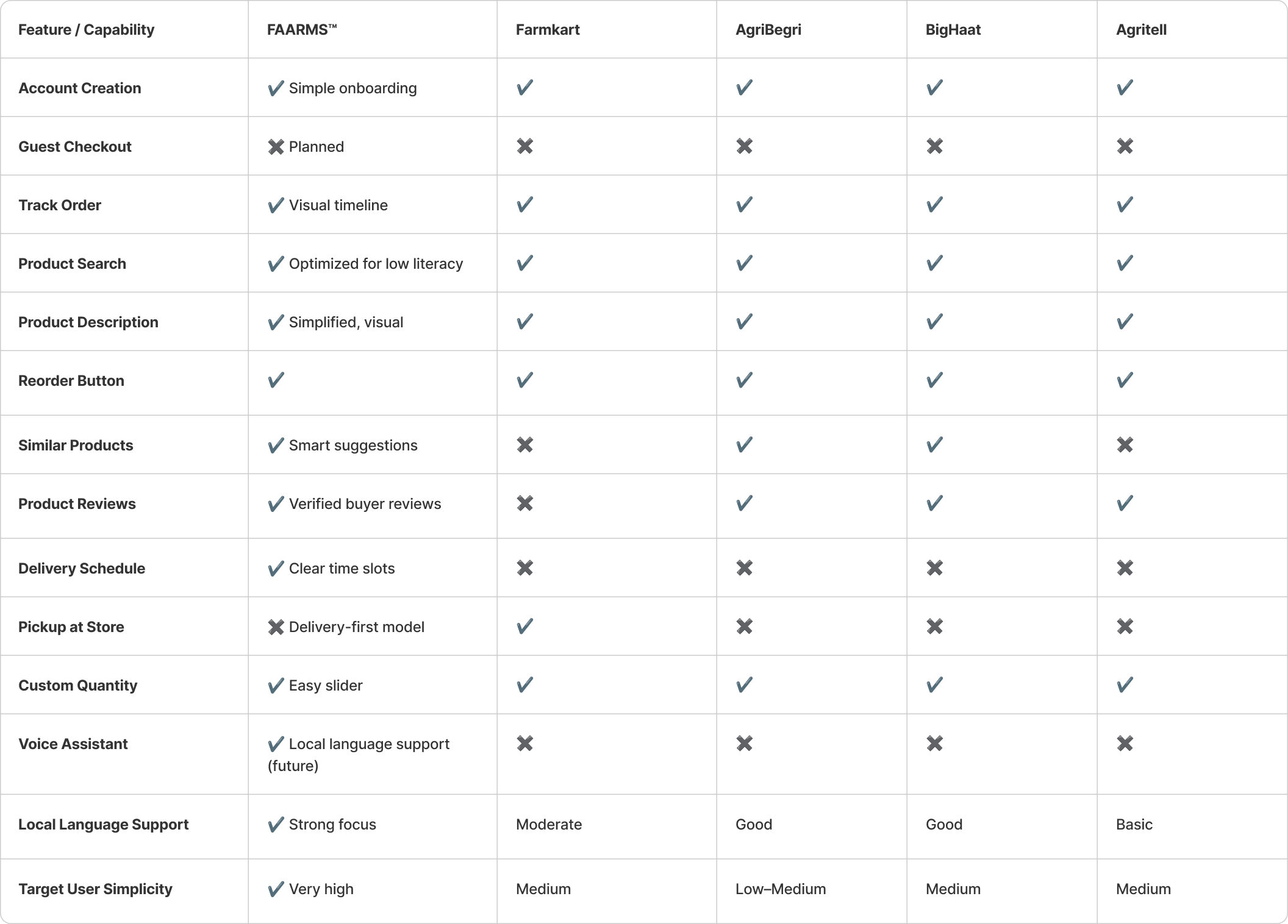
Competitor Comparison Chart
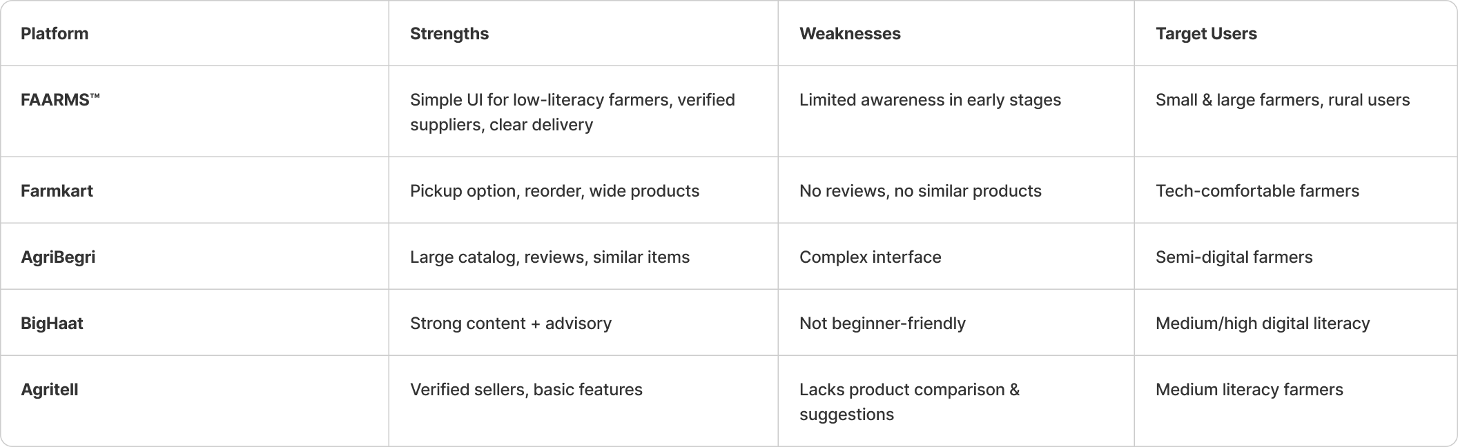
Market Positioning Comparison
To understand the real challenges faced by farmers, I conducted user research through field visits, one-on-one interviews, and remote conversations with both small and large-scale farmers. The goal was to learn how they currently purchase agri-inputs, the obstacles they face in accessing quality products, and their comfort level with using mobile technology. Many farmers shared that they rely heavily on local shops with limited options and often struggle to verify product authenticity or compare prices. A major insight was that most users-especially in rural areas-had very little experience using smartphones, making complex digital interfaces difficult to navigate. Through this research, I uncovered clear patterns around trust, accessibility, and usability, which informed the need for a simple, guided, and highly visual platform that supports farmers at every step of their buying journey.
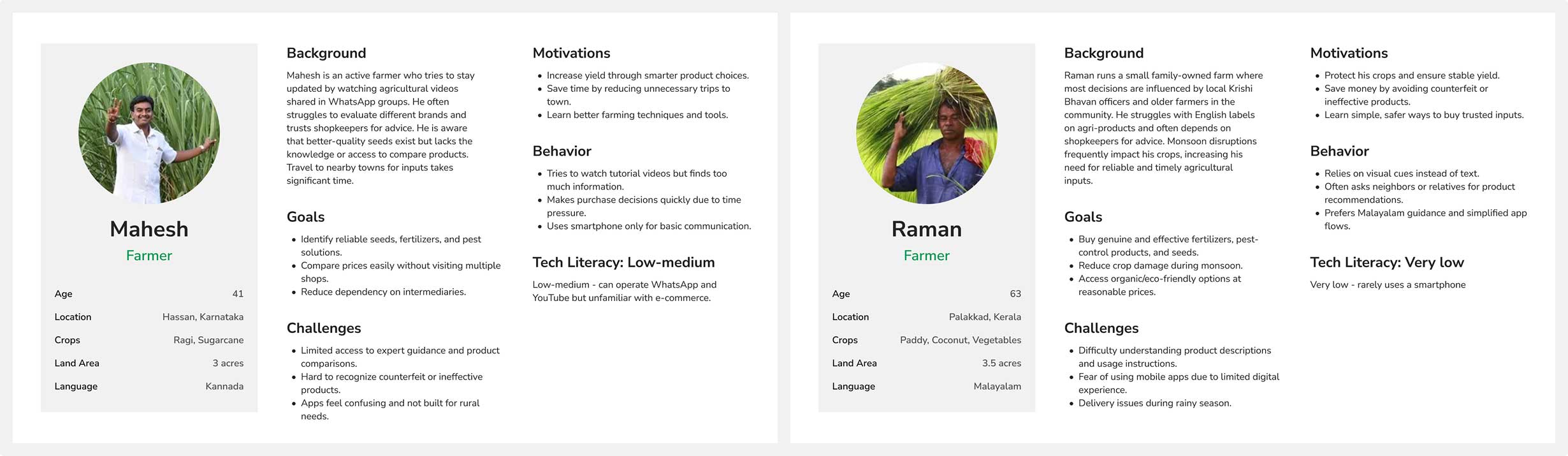
To understand the diverse needs of farmers across different regions, I developed four user personas representing key segments of the agricultural community. These personas were shaped through qualitative interviews, field observations, and user behavior studies conducted with farmers who varied in age, digital literacy, land ownership, and crop types. Each persona highlights a distinct set of motivations, challenges, and expectations from a digital agri-commerce platform.
The personas help illustrate how factors such as digital comfort, language preference, farming scale, and regional crop conditions influence user experience. They also reveal critical usability needs, including simplified navigation, trusted product information, local-language support, and reliable delivery. These personas guided the design decisions throughout the project, ensuring that the product remained accessible, intuitive, and relevant to farmers with limited technological exposure as well as those managing larger, more modern operations.
Farmers face significant challenges in accessing genuine, high-quality agricultural inputs due to fragmented local markets, inconsistent pricing, and limited product transparency. Many rely heavily on shopkeepers and word-of-mouth recommendations, which often leads to poor product choices and low crop performance. Limited digital literacy makes it difficult for them to use existing online platforms, which are not designed with their needs in mind. As a result, farmers lack a simple, trustworthy, and accessible way to discover reliable products, compare prices, and receive timely deliveries that support their farming activities.
To explore multiple solution directions and generate creative ideas, I conducted structured brainstorming sessions involving product managers, engineers, field experts, and designers. These sessions focused on understanding farmers’ real-world challenges and converting them into actionable design opportunities. We used methods such as How Might We (HMW) questions, Crazy 8s, pain-point clustering, and rapid sketching to break down complex problems into simple, user-centered concepts.
During these sessions, the team explored ways to simplify product discovery, communicate trust clearly, support low digital literacy, and reduce friction in ordering and delivery workflows. The ideas were then grouped into themes such as “trust building,” “guided navigation,” “local-language support,” and “delivery reliability.” These sessions helped align the entire team on the direction of the solution and ensured that every feature emerged from real user needs rather than assumptions.
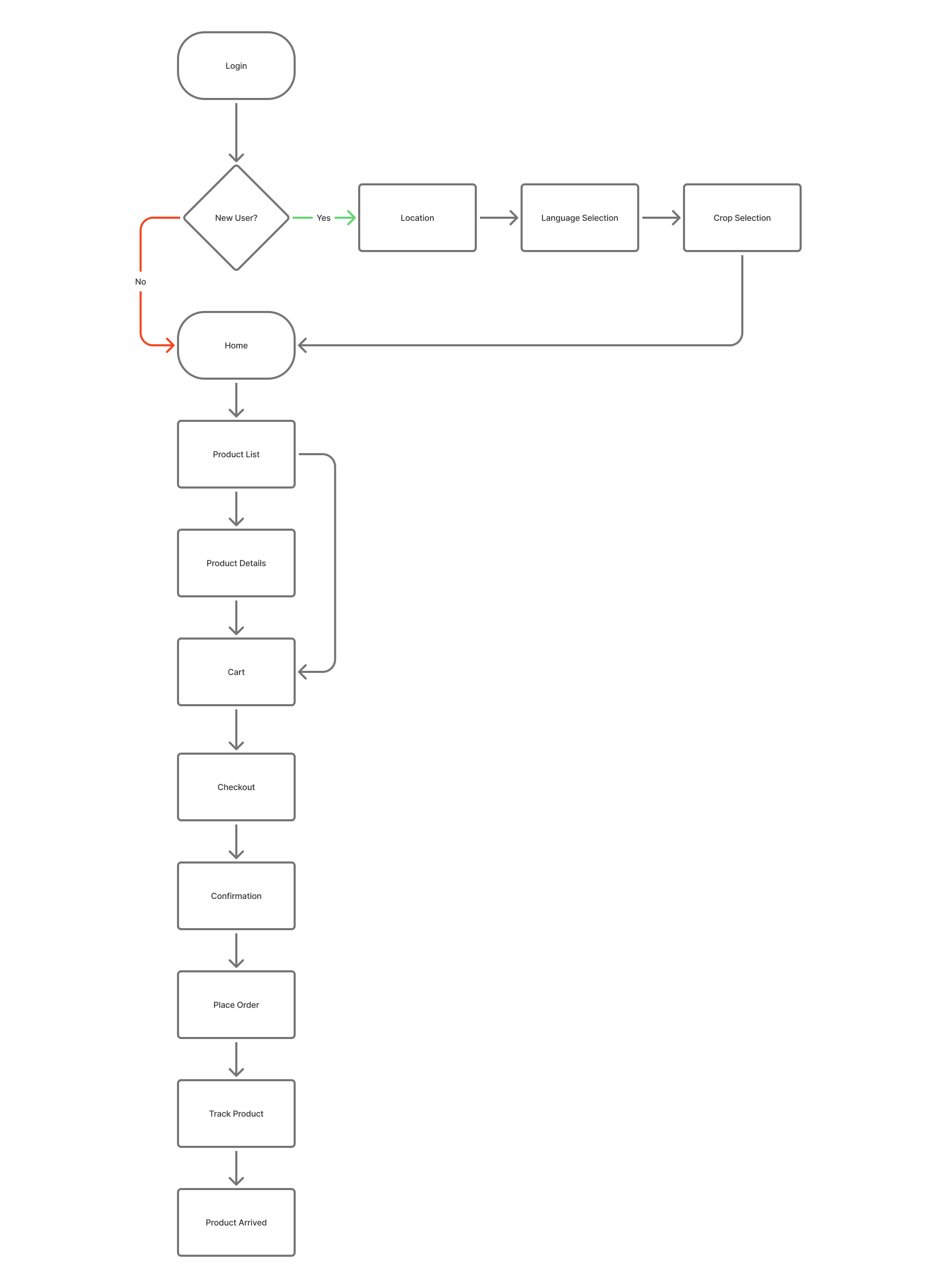
The graphic illustrates the complete sequence a user follows to place an order. It begins with the user logging into the app, followed by browsing or searching for a product. After selecting the item, the user reviews the details and adds it to the cart. They then proceed to checkout, confirm their delivery address, choose a payment option, and place the order. The final step shows the order being processed and delivered, completing the user journey.
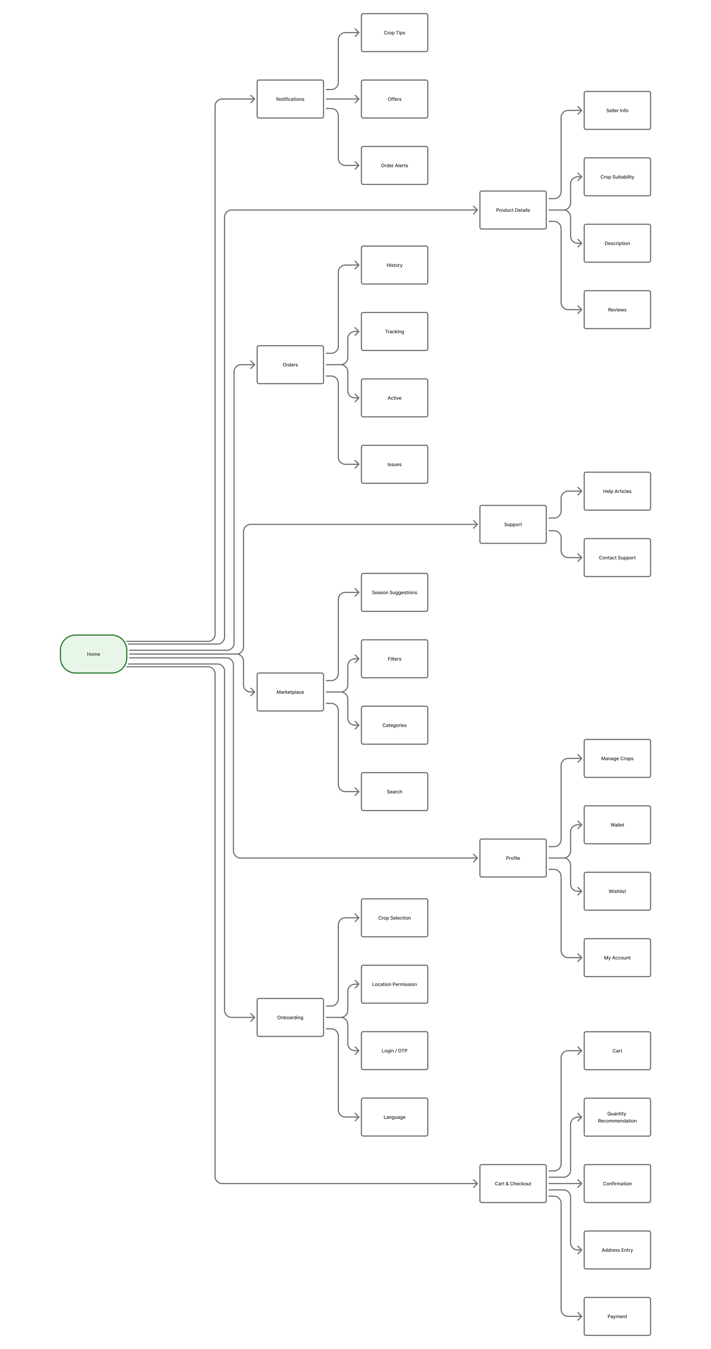
This sitemap organizes the app into logical sections, making core journeys-like product discovery, checkout, and tracking-quick and easy to access.
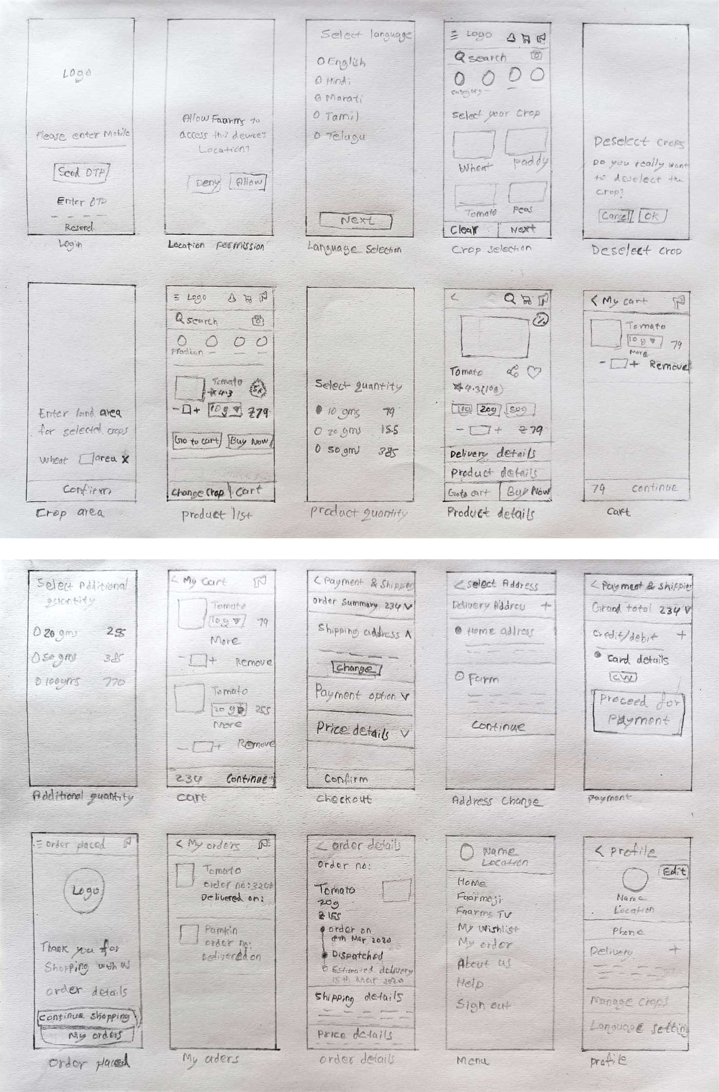
Before investing time and resources into a pixel-perfect design, I brainstormed wireframes to establish the basic structure and flow.
Here are a few initial hand-drawn wireframes I created that proved invaluable in sparking new ideas and concepts throughout the process. These sketches helped me communicate my initial thoughts and vision effectively.
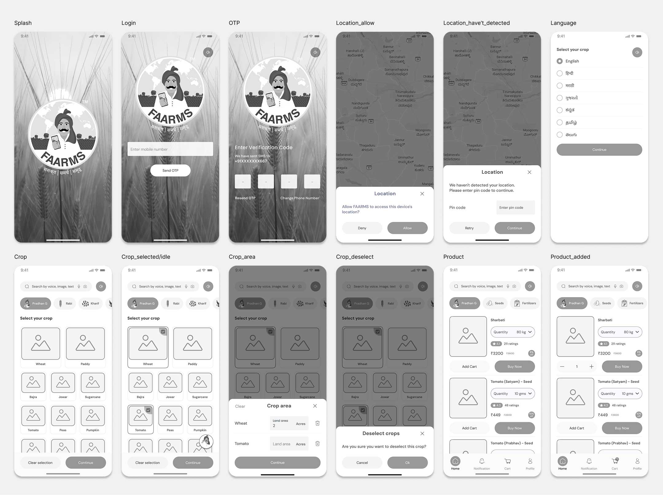
High Fidelity Wireframes/ Mockups
Here are four screens showcasing High-fidelity wireframes.
Features Added
To improve accessibility for low-digital-literacy farmers and enhance overall usability, several intelligent and localized features were introduced. These updates ensure that the FAARMS experience feels more intuitive, culturally familiar, and guided at every step.
1. Full Localization Support
Impact: Farmers can confidently navigate the app in their own language without confusion.
2. Voice Narration on Every Page
Impact: Farmers can confidently navigate the app in their own language without confusion.
3. Location & Season–Based Personalization
Impact: Helps farmers choose the right crop and right products at the right time.
4. Intelligent Product & Quantity Suggestions
Impact: Reduces search effort, improves accuracy, and saves time.
5. Minimized Clicks, Scrolls & Search Effort
Impact: Faster task completion and a smoother, more efficient experience.
6. Smart, Guided Onboarding
Impact: Users understand the app instantly and get value in the first minute.
A high-fidelity clickable prototype was tested with 10 farmers from Karnataka, Kerala, and Punjab. As the prototype was non-functional, users interacted only with static screens and tap-based navigation. The goal of the test was to evaluate screen clarity, flow comprehension, and overall usability.
Positive feedback: “Selecting crops is easy; I know what to choose.”
Negative feedback:Positive feedback: “Products are clear. I can understand what to tap.”
Negative feedback:Positive feedback: “This flow is simple; I can complete the steps.”
Negative feedback:Even with static screens, farmers clearly understood:
But they also highlighted real-world needs:
Viability: To understand whether the proposed flow and feature concepts are practical and realistic for farmers. The focus was on evaluating whether the steps made sense, the content felt relevant, and the overall experience aligned with farmers’ expectations and real-world behaviors.
Usability: To assess how easily farmers can navigate the prototype, complete tasks, and understand each screen without external help. Since the prototype was static, the goal was to observe interaction clarity, flow comprehension, and screen readability.
A moderated usability test was conducted using a high-fidelity clickable prototype, where farmers interacted with static screens through simple tap navigation. Each session followed a structured protocol: a brief warm-up, introduction to the prototype, task-based exploration (crop selection, product browsing, and order flow), and a short post-test interview. The facilitator observed user behavior, hesitation points, and overall comprehension without giving direct guidance. This approach helped evaluate screen clarity, navigation flow, and ease of use for low-digital-literacy farmers.
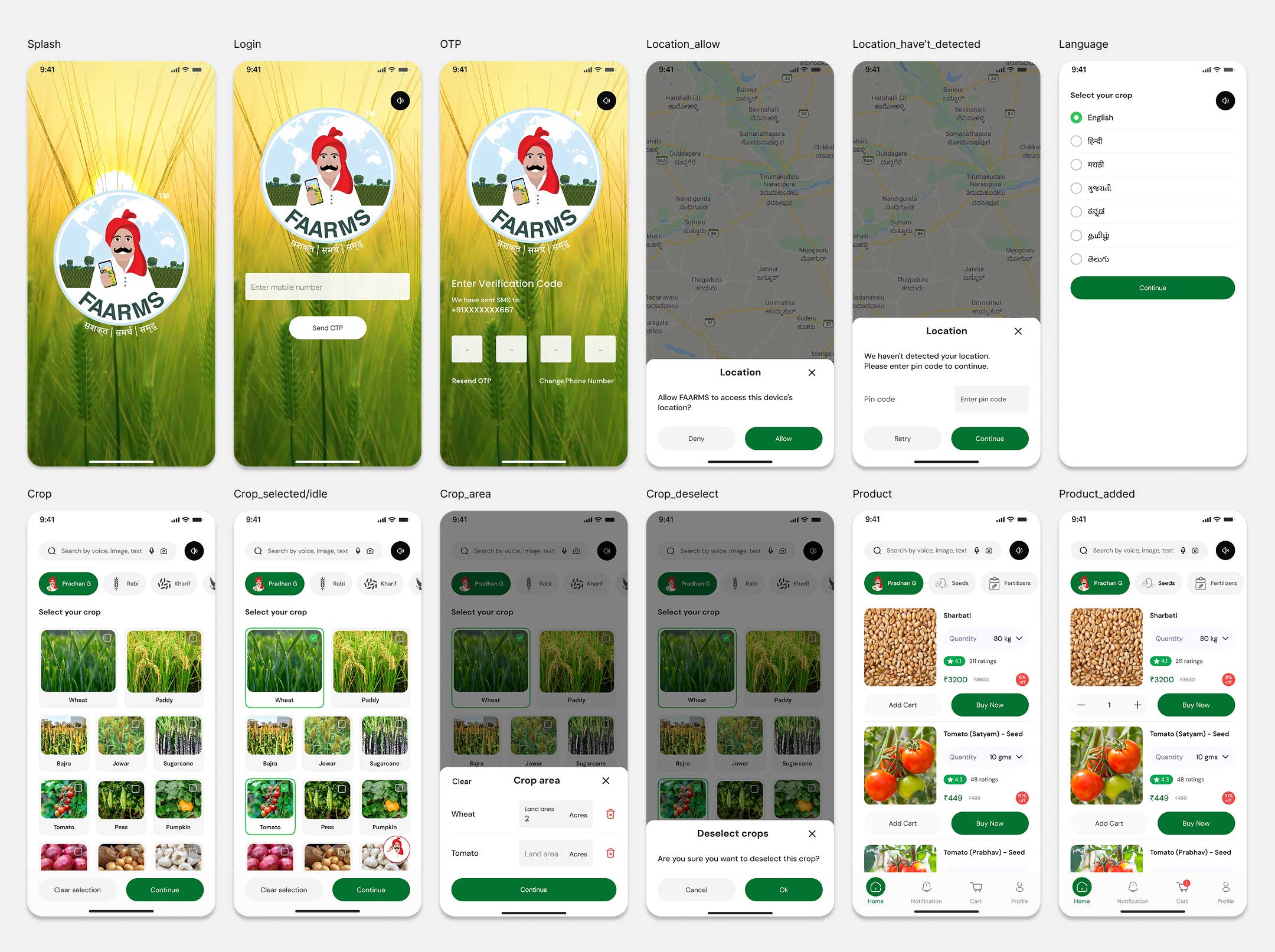
Final Designs
The final design delivers a clean, simple, and farmer-friendly experience with clear visuals, large touch targets, and minimal steps. Key flows such as crop selection, product discovery, and checkout were streamlined to reduce scrolling and clicks. Product cards highlight essential information and crop suitability at a glance, while the checkout process follows a clear, step-by-step structure. Overall, the design focuses on clarity, ease of use, and faster task completion, ensuring the app feels intuitive and accessible for farmers of all literacy levels.
As the product evolves, the next set of improvements will focus on strengthening guidance, trust, and decision support for farmers who are just beginning to adopt digital tools. Planned enhancements include introducing an AI-assisted crop advisory system that provides simple, actionable tips for sowing, fertilizing, and managing pests-especially useful for farmers who previously relied only on local shopkeepers for advice. Mandi price comparisons and basic price trend insights will help farmers make more informed purchasing decisions at a time when market transparency was limited. Features like smart reorder reminders and curated product bundles will simplify repeated shopping tasks, while a community discussion space and access to agricultural experts will offer much-needed support for farmers who may not have reliable information sources. Additional improvements such as lightweight offline access, clearer delivery updates, flexible payment options, and a personalized home dashboard will further reduce friction for users with low connectivity, limited digital literacy, and inconsistent access to resources. These enhancements aim to transform the app into a practical, reliable farming companion suited for the technological realities of rural India during this period.