Mariner Finance offers personal, auto, and home improvement loans with a streamlined, mobile-first application process.
View live prototypeBusiness Goals: Mariner aimed to reduce drop-offs, increase loan conversions, and reduce support team burden by offering clear and guided steps throughout the journey.
User Goals: Users wanted a straightforward way to apply for loans, understand the repayment structure, and track their approval status. They also expected transparency around credit score checks and the ability to compare offers easily.
Our challenge was to build a mobile experience that felt trustworthy, fast, and stress-free. The app needed to provide instant clarity on EMI, allow easy comparison of available offers, and ensure users felt safe-even during sensitive steps like credit score checks.

Discussions with loan officers and customer support teams revealed real-world friction points. Many users called repeatedly to ask about loan status, fearing something had gone wrong. Support teams also mentioned that unclear APR terms caused a significant number of dissatisfied calls. This confirmed the need for simple, transparent messaging.
User interviews reaffirmed that speed and clarity drive decision-making. Users repeatedly mentioned frustration with repeated data entry, confusion about whether loan enquiries affect credit scores, and difficulty understanding APR. Several users also said they would abandon the application if it involved more than "two or three long forms."
A quick survey with 43 participants produced clear trends:
These data points validated our design direction.
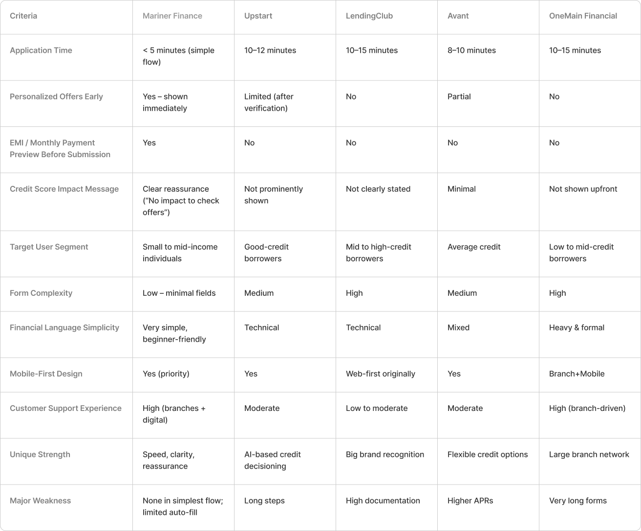
The U.S. digital lending landscape was dominated by platforms like Upstart, LendingClub, SoFi, Avant, and OneMain Financial. Although these services provided reliable online loan experiences, most required users to complete lengthy forms before revealing any meaningful details such as estimated monthly payments or total repayment amounts. Personalization was limited early in the process, often appearing only after multiple verification steps, which made the journey feel generic and time-consuming. Many interfaces relied heavily on dense financial terminology, creating additional confusion for small- and mid-income borrowers who needed clearer explanations. Furthermore, most competitors did not clearly communicate whether checking loan offers would impact a user’s credit score-an important concern for first-time applicants. These gaps highlighted a strong opportunity for Mariner Finance to differentiate itself through a faster application experience, upfront EMI visibility, early personalized offers, simple language, and consistent trust-building messages throughout the loan journey.
Competitor Comparison Chart
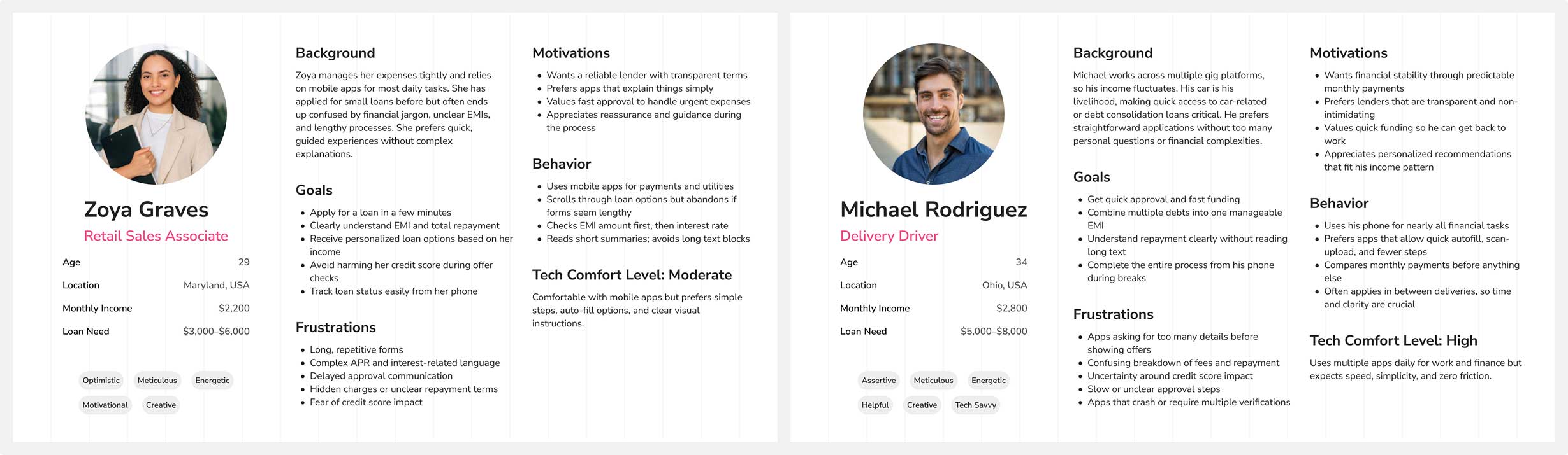
Small- and mid-income borrowers need a simple, fast, and reassuring loan application experience that helps them make confident financial decisions. They want clear visibility into monthly payments, interest rates, and total repayment before committing to any loan. Users also need guidance in simple language-free from financial jargon-so they can understand each step without feeling overwhelmed.
They expect a mobile-first journey with minimal form fields, quick verification, and transparent communication about credit score impact. Since many users are first-time borrowers, trust plays a major role; they need upfront clarity, personalized offers, and reassurance that the process is safe and secure.
In addition, users want flexible repayment tools like an EMI calculator, quick status updates through mobile notifications, and an easy way to track their loan after approval. Overall, the experience must feel reliable, transparent, and designed around their financial comfort level.
These personas were developed based on insights gathered from user interviews, video recordings, analysis of the existing application, and survey responses. Our primary persona represents an experienced plant operator with deep, hands-on knowledge of processes-someone who values speed, reliability, and minimal disruption during shift operations. In contrast, our secondary persona reflects a less-experienced team member, such as a trainee or new hire, who may lack domain knowledge but still needs to quickly understand workflows, navigate the system confidently, and complete tasks without hesitation.
By designing for both ends of the experience spectrum-expert and novice-we ensured the platform supports power users while remaining intuitive and accessible to newcomers, fostering smoother adoption across roles and shifts.
Many small- and mid-income borrowers find the loan application process overwhelming due to lengthy forms, complicated financial terminology, and unclear repayment details. Most existing loan apps reveal essential information-such as EMI, total repayment, and interest rates-only after several steps, creating confusion and increasing drop-offs. Users are also unsure whether checking loan offers will impact their credit score, which adds another layer of hesitation.
As a result, borrowers who rely on quick personal loans for everyday needs often feel anxious, unsupported, and uncertain while applying. They need a simple, transparent, and mobile-first loan experience that guides them step-by-step, explains costs in easy language, and builds trust through clarity and reassurance. A redesigned experience must reduce friction, provide upfront transparency, and help users complete their loan journey with confidence.
To address the core challenges-long forms, low clarity on EMI, and anxiety around credit score impact-we organized multiple brainstorming sessions using methods like rapid sketching, mind mapping, and collaborative problem framing. These sessions focused on simplifying the loan journey, reducing cognitive load, and improving trust through clear and supportive design. Each round encouraged open exploration before narrowing down to realistic, high-impact ideas aligned with Mariner Finance’s goals.
These discussions helped us uncover opportunities to streamline the user flow, provide upfront transparency, and support users with clear explanations. From these sessions, we shaped the foundation for redesigning the application process, introducing early EMI previews, auto-fill features, and a guided loan journey that feels simple, predictable, and user-friendly.
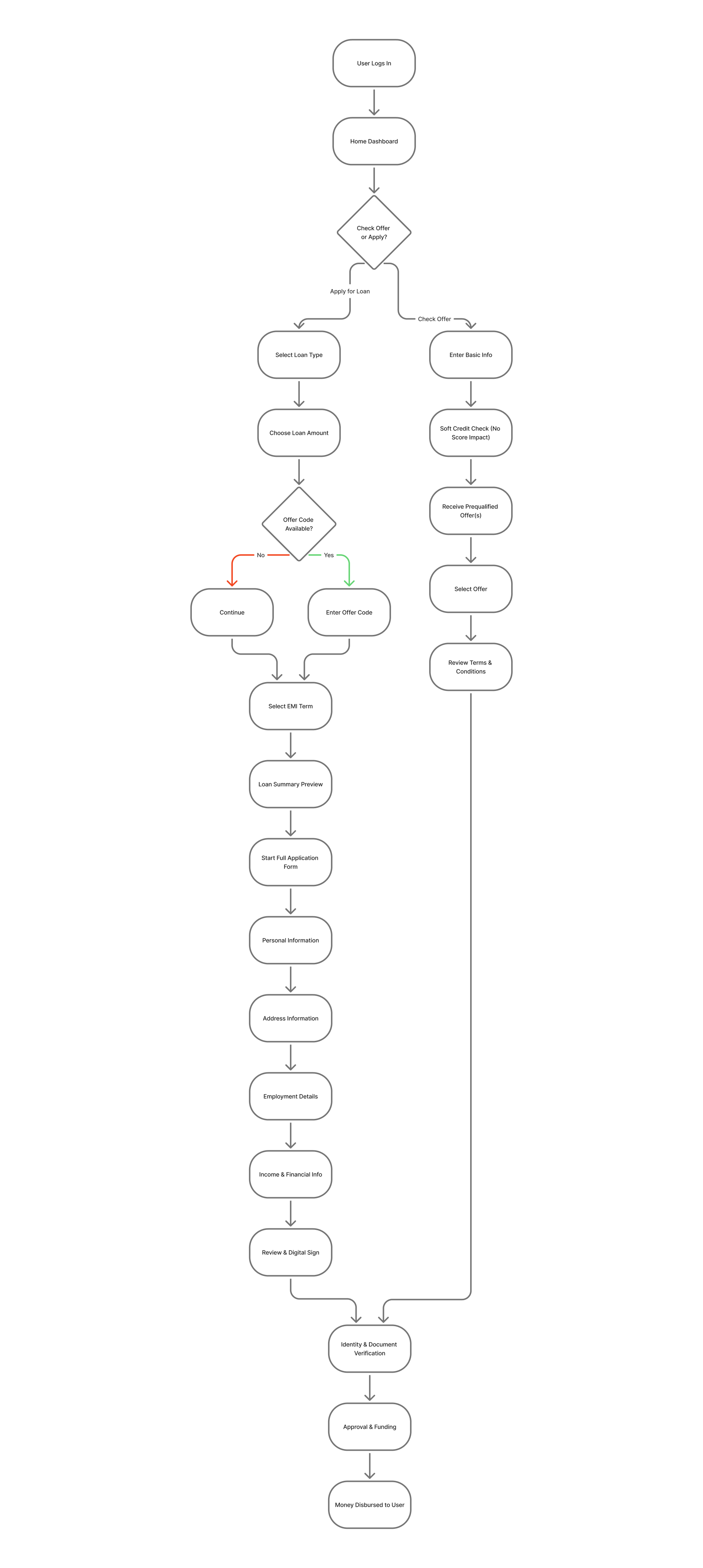
The following graphic illustrates the end-to-end process flow, combining user actions with internal Mariner Finance operations such as checks, verification, approval, and funding.
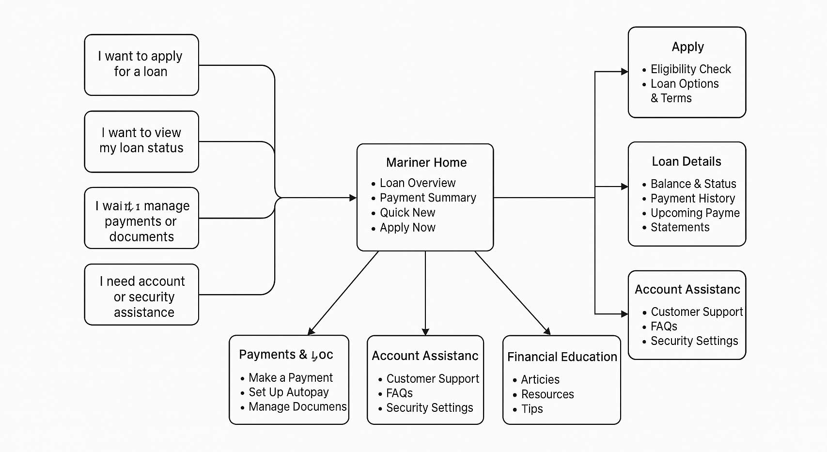
The following graphic shows the user flow for how borrowers navigate the Mariner Finance app-from login to selecting loan options, completing required steps, and submitting their application.
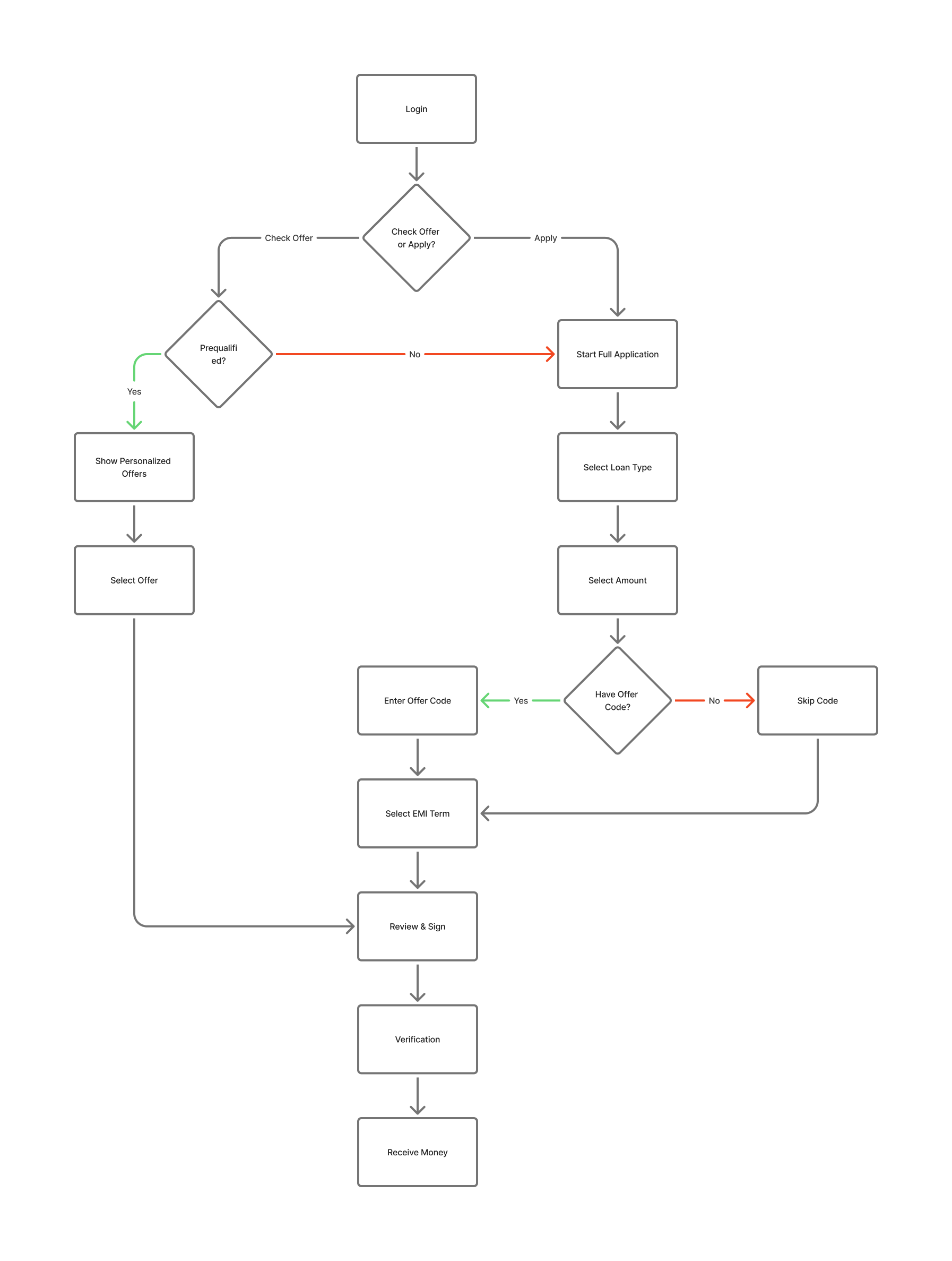
Determining the possible user flows helped narrow down which interfaces would be needed for the product.
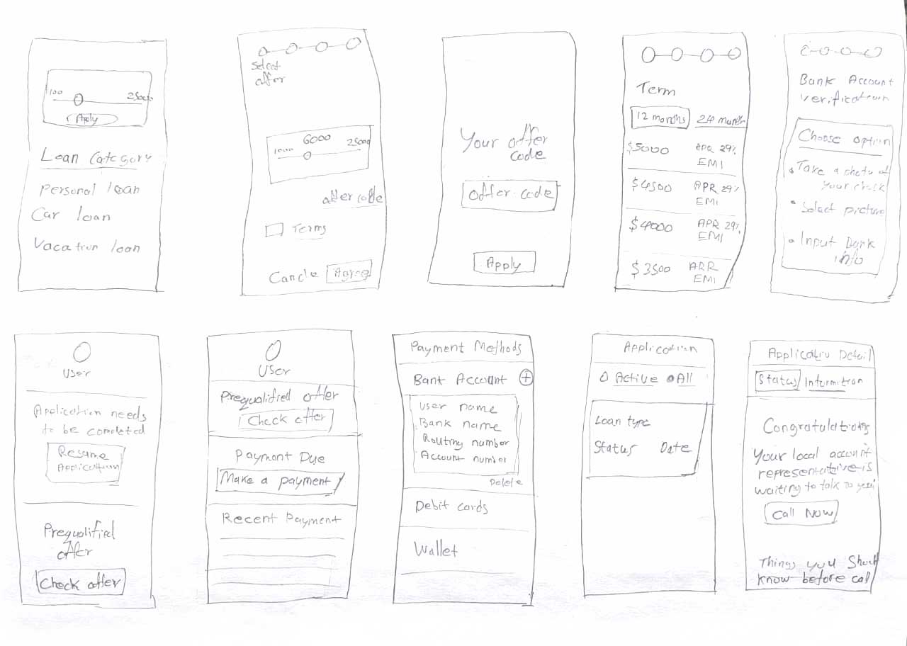
Before moving into detailed visual design, I created exploratory wireframes to define the core structure, user journey, and key interactions for the Mariner Finance loan application flow.
Here are a few initial hand-drawn wireframes I created that proved invaluable in sparking new ideas and concepts throughout the process. These sketches helped me communicate my initial thoughts and vision effectively.
High Fidelity Wireframes/ Mockups
Here are four screens showcasing High-fidelity wireframes.
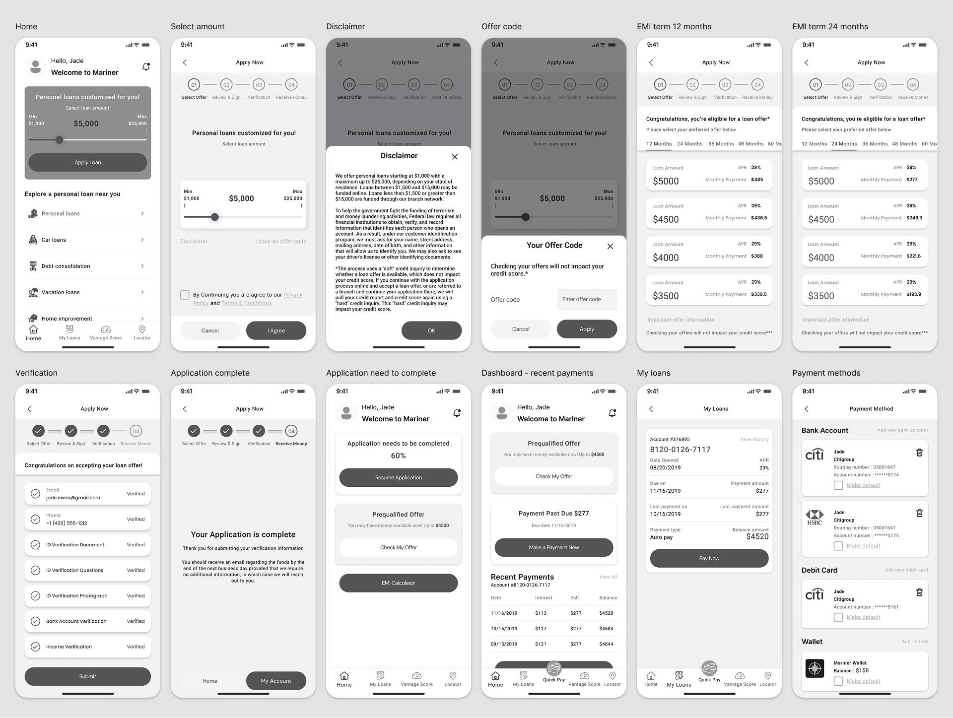
Features Added
Before moving into detailed design, I ran a Concept Validation Test using low-fidelity wireframes and feature sketches. The goal was to confirm whether the proposed loan flow-offer checking, EMI preview, guided forms, and document upload-matched user expectations. Feedback helped validate the direction and refine early ideas before creating the full prototype.
The testing focused on evaluating:
These goals ensured the experience remained simple, transparent, and user-friendly.
Prototype TestingI tested a high-fidelity mobile prototype with real users through moderated, task-based sessions. Participants completed key actions-checking loan offers, adjusting EMI, filling details, uploading documents, and reviewing terms-while thinking aloud. Their behavior and feedback helped refine the flow, clarify terminology, and improve trust-building elements before development.
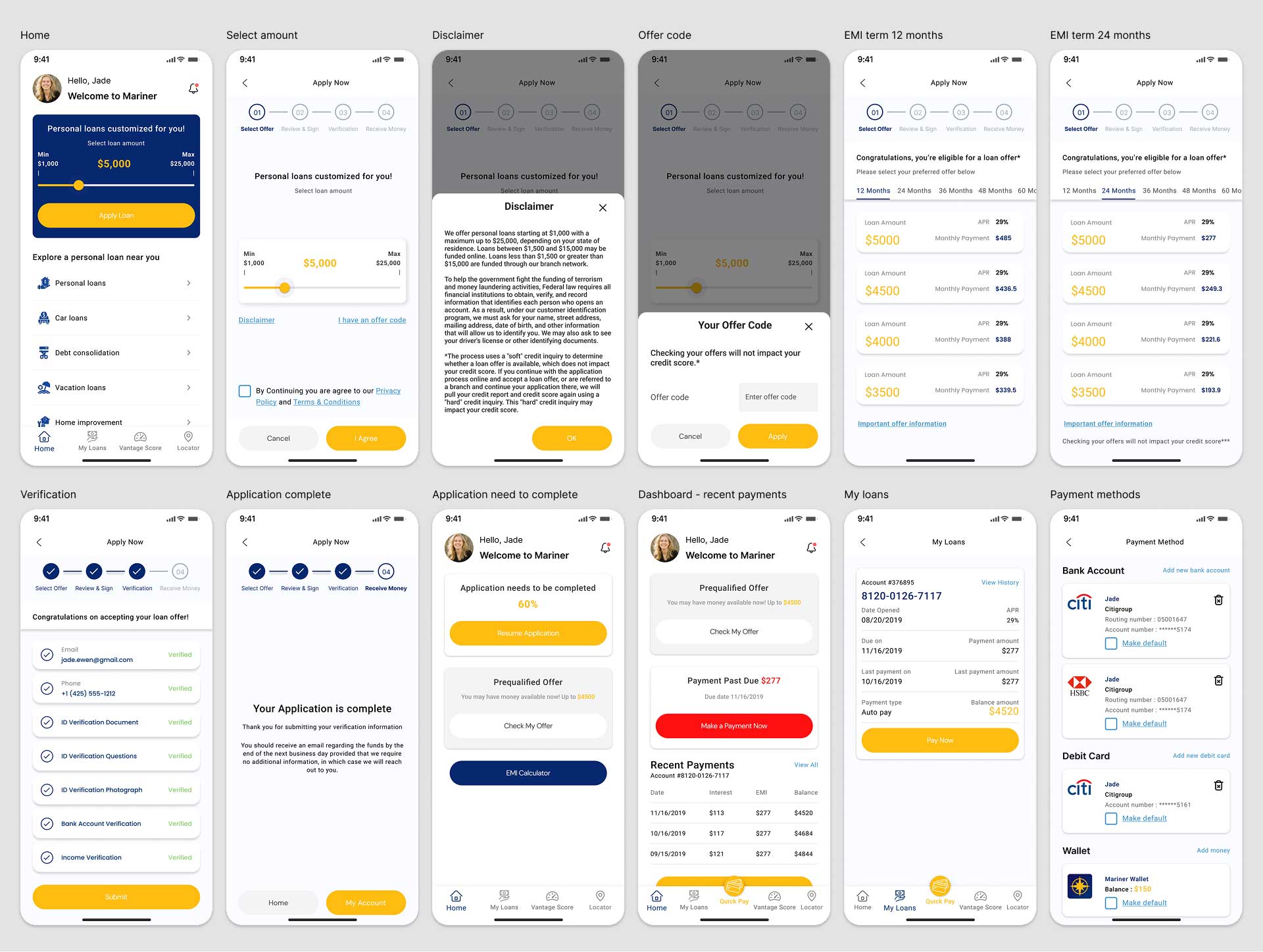
Final Designs
Our final designs integrate key insights from concept validation and usability testing to create a clearer, more user-friendly loan application experience. Each screen focuses on simplifying the flow, highlighting essential financial details, and building trust at crucial decision points.
While the complete end-to-end loan journey isn’t shown here, the following high-fidelity screens represent the core interactions-from starting an application to reviewing loan details-demonstrating how the redesigned experience improves clarity, confidence, and ease of use for borrowers.
View live prototype
In the next phase, the focus is on strengthening the entire loan lifecycle by introducing deeper personalization, improving automation, enhancing transparency, and refining the user experience based on real-world feedback. A major priority will be accelerating the loan application process by reducing steps, simplifying inputs, and enabling a faster “Apply Loan” experience. These initiatives aim to reduce friction, improve trust, and support borrowers more effectively from application to repayment.