From paper logs to real-time decisions: save time, improve accuracy, and keep pulp quality on spec.
View live prototypeShift supervisors, plant managers, and operators needed better tools to monitor pulp quality across shifts and equipment. Manual logs were prone to data loss and hard to aggregate, resulting in hours spent on redundant reporting and decreased responsiveness to anomalies.

To align the product vision with business needs and technical feasibility, I conducted stakeholder interviews early in the project. These sessions helped clarify expectations, define success metrics, and identify constraints from a leadership, operational, and engineering perspective.
To deeply understand the day-to-day challenges of pulp mill staff, I conducted both quantitative and qualitative user research using Google Forms surveys and Zoom interviews. I also remotely observed operators and supervisors during live shifts to understand how they logged data, identified anomalies, and communicated across teams. I interviewed six participants and distributed a Google Form to 40 others across roles-including line operators, shift supervisors, and a quality analyst-to understand not just their tasks, but the reasoning behind them. The interviews were semi-structured and open-ended, designed to surface real behaviors and mental models rather than just collect feature requests. These insights formed the foundation for developing personas, journey maps, and the product’s core design strategy.
Q2. How and where do you currently log production or quality data?
We write it on a clipboard near the machine. At the end of the shift, I copy it into an Excel sheet.Q4. How do you know if something is out of spec or abnormal?
We have a printed chart with acceptable ranges taped on the wall. I check against that.Q6. How long does it take you to compile your shift or quality report?
At least 1-1.5 hours, especially when I need to pull data from different sources.Based on interviews with plant supervisors, quality managers, and key stakeholders, the Product Manager outlined a roadmap focused on improving reporting speed, data accuracy, and real-time visibility. From there, I conducted competitive research on digital logging tools, industrial dashboards, and legacy systems used in pulp production. I evaluated their usability, alert mechanisms, data validation methods, reporting workflows, and compatibility with manual entry and sensor data. This competitive analysis helped identify UX gaps and opportunities that directly informed our early design directions.
To benchmark the Pulp Tracking & Optimizer experience, I analyzed leading industrial tracking tools and internal legacy systems. Since most third-party solutions in this space are proprietary and not publicly accessible, I relied on hands-on testing of client tools, stakeholder discussions, and operator interviews to understand common UI patterns, pain points, and unmet needs.
I reviewed SCADA dashboards, mobile reporting apps, and production quality systems to evaluate their effectiveness in pulp mill environments. This helped highlight gaps in speed, feedback, and flexibility-especially under real-time operational demands.
One standout was Shiftconnector’s alerting and drilldown model, which inspired our own alerts panel design. I adapted it to allow real-time anomaly detection, contextual drilldowns, and in-place resolution logging-all from a unified dashboard. This approach minimized disruption while keeping critical insights immediately accessible.
User needs were identified through field research, interviews, and post-test feedback. These insights were translated into actionable requirements and prioritized across seven key design phases, beginning with a clearly scoped MVP (Minimum Viable Product) that emphasized essential functionality for frontline plant workers and supervisors.
For the MVP, operators and supervisors needed-at minimum:
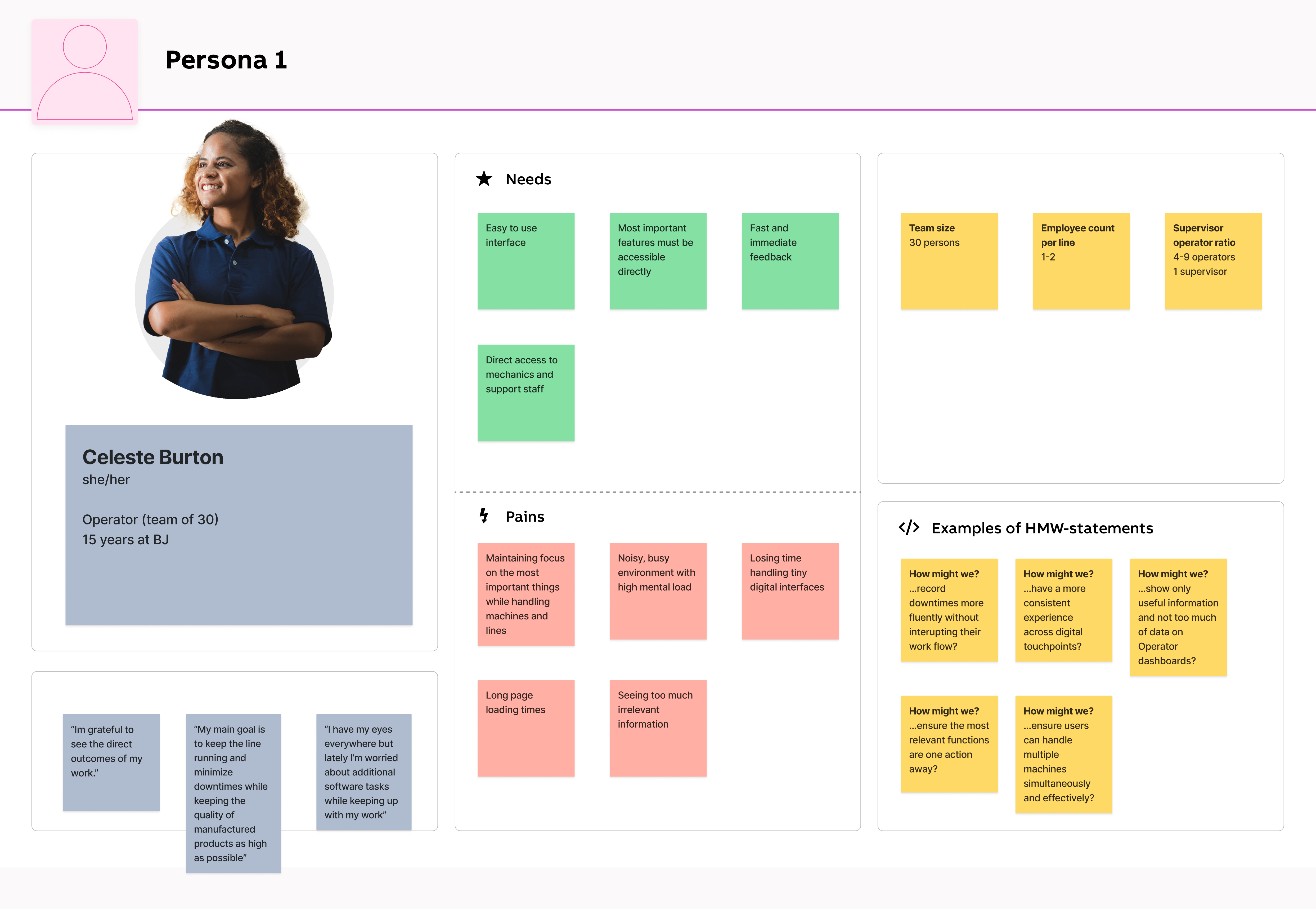
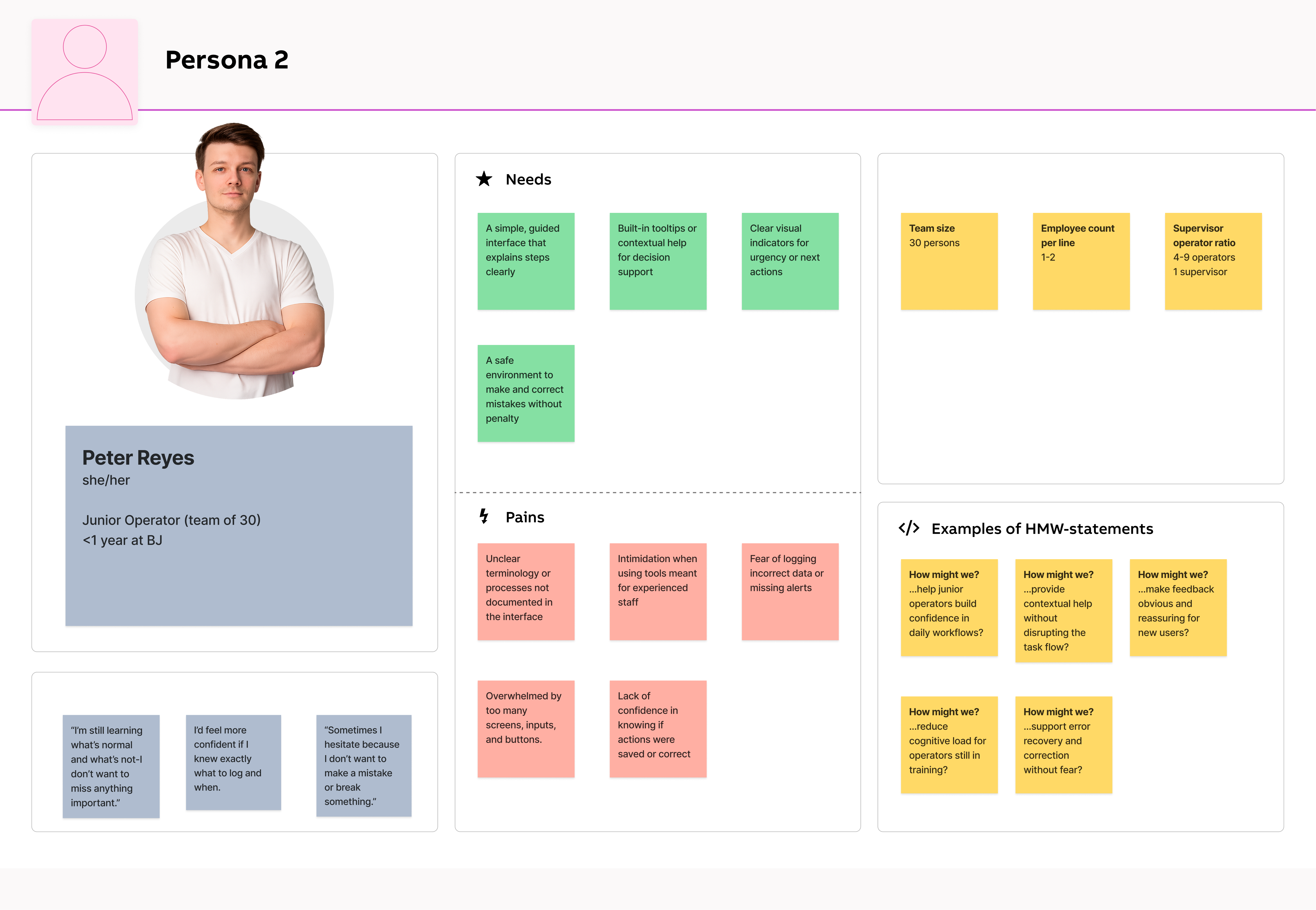
These personas were developed based on insights gathered from user interviews, video recordings, analysis of the existing application, and survey responses. Our primary persona represents an experienced plant operator with deep, hands-on knowledge of processes-someone who values speed, reliability, and minimal disruption during shift operations. In contrast, our secondary persona reflects a less-experienced team member, such as a trainee or new hire, who may lack domain knowledge but still needs to quickly understand workflows, navigate the system confidently, and complete tasks without hesitation.
By designing for both ends of the experience spectrum-expert and novice-we ensured the platform supports power users while remaining intuitive and accessible to newcomers, fostering smoother adoption across roles and shifts.
While the product allowed operators to log data and monitor production, the existing workflow relied heavily on manual spreadsheets and fragmented digital tools. This led to slow data capture, inconsistent reporting, and frequent human errors-especially under shift pressure. The user experience lacked clarity and efficiency, with interfaces burdened by excessive screens, irrelevant content, and scattered data. Operators often struggled to locate key information quickly amidst cluttered layouts and redundant navigation paths.
Additionally, users had to toggle between multiple applications-for monitoring, configuration, and reporting-which created workflow silos and confusion. The complexity was particularly overwhelming for new or rotating staff, while experienced operators found the interface too slow and bloated for fast-paced work environments.
Support teams were frequently involved in helping users set up or modify tracking workflows, increasing operational costs and introducing delays. Meanwhile, competitors offered more focused, streamlined, and self-service-friendly solutions-putting us at risk of falling behind.
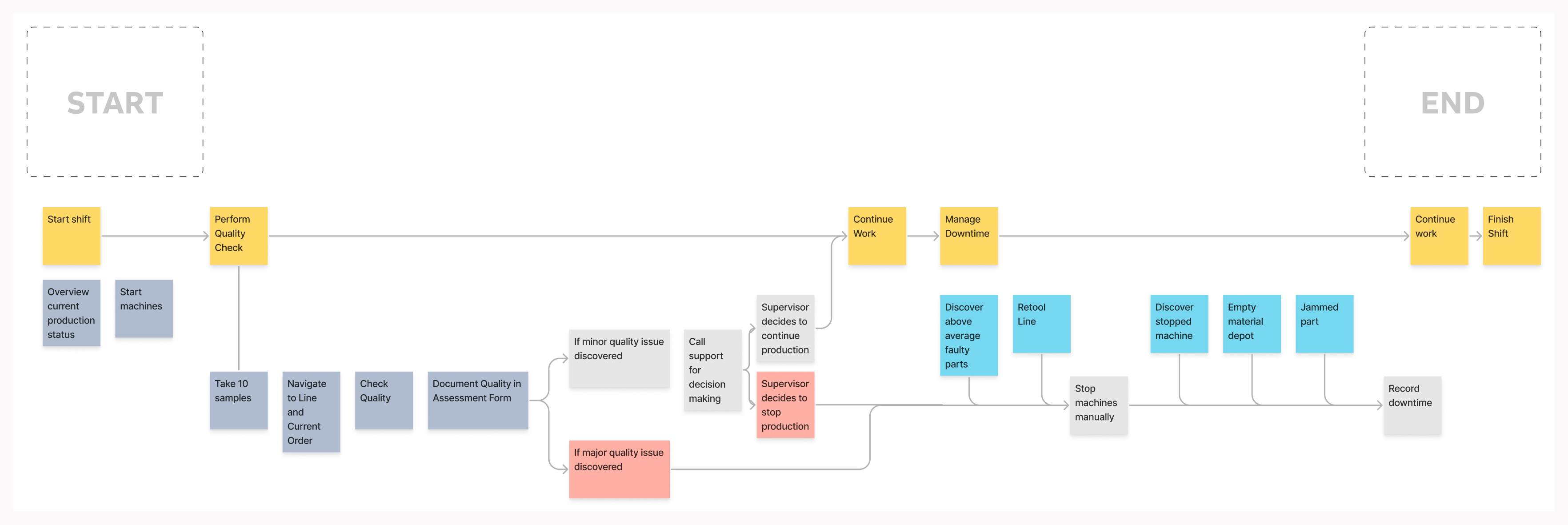
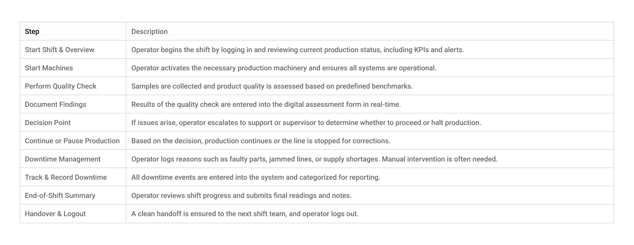
Operators begin their shift by checking production status and starting machines, then move into quality checks and logging data. If issues arise, they contact support or escalate to supervisors, sometimes halting production. Downtime events like machine faults or material shortages require manual responses and documentation. The day ends with continued production and shift handover. This fragmented, manual workflow highlights the need for a more streamlined, supportive digital system.
To bridge the gap between user pain points and potential design solutions, I led a series of focused brainstorming sessions with operators, supervisors, and product stakeholders. These sessions were designed to explore creative ideas around simplifying daily tasks, reducing downtime logging friction, and improving real-time visibility on the shop floor.
This flow captures the digital journey of an operator using the Pulp Tracking & Optimizer application. The system simplifies key shift actions, reducing manual effort, escalation delays, and fragmented tool use.
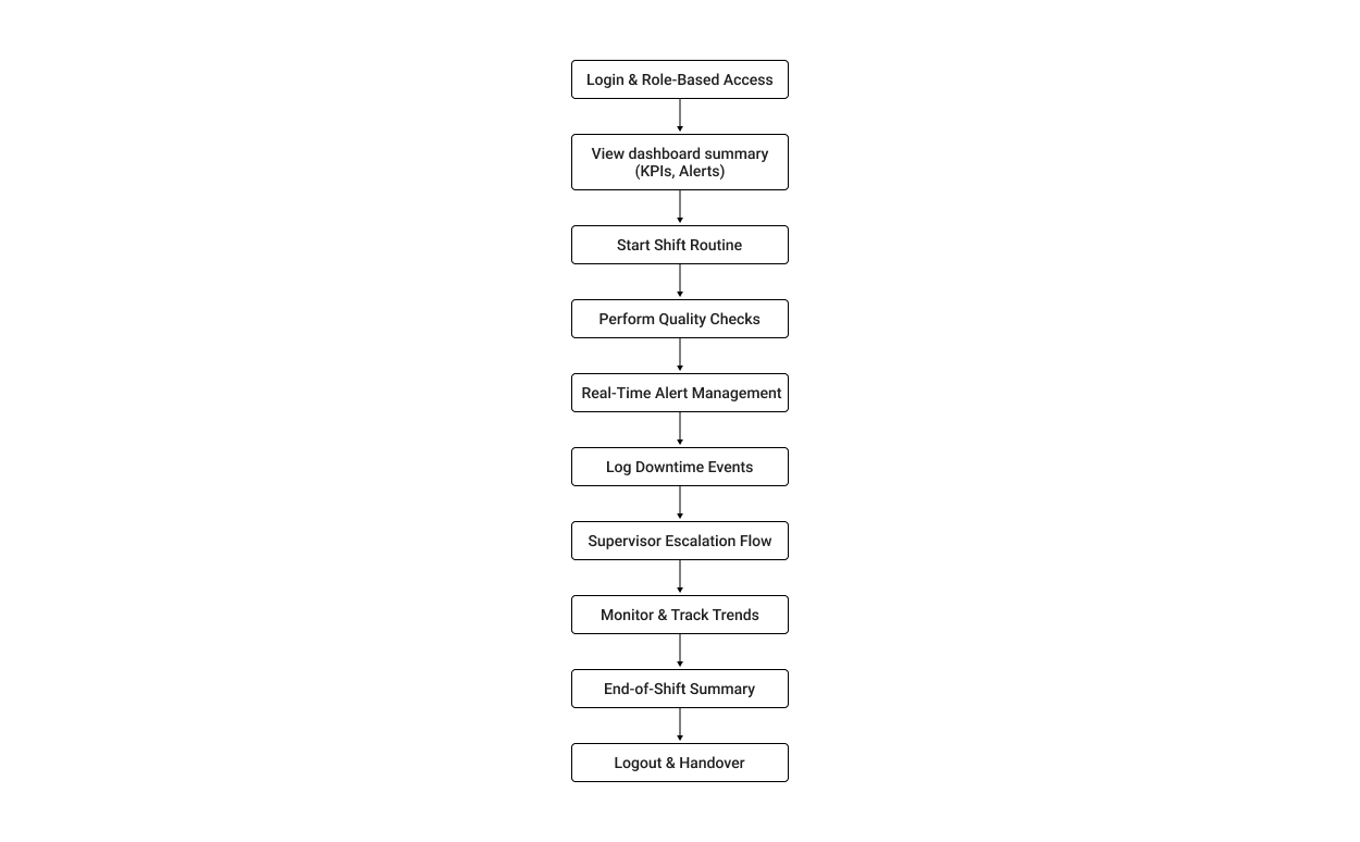
The following graphic depicts the user flow for working with Pulptracking.
Determining the possible user flows helped narrow down which interfaces would be needed for the product.
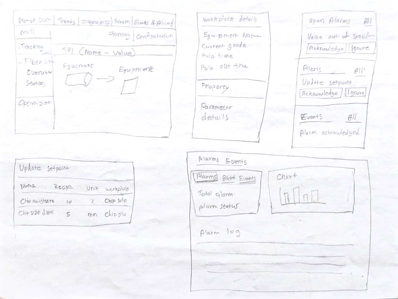
Before investing time and resources into a pixel-perfect design, I brainstormed wireframes to establish the basic structure and flow.
Here are a few initial hand-drawn wireframes I created that proved invaluable in sparking new ideas and concepts throughout the process. These sketches helped me communicate my initial thoughts and vision effectively.
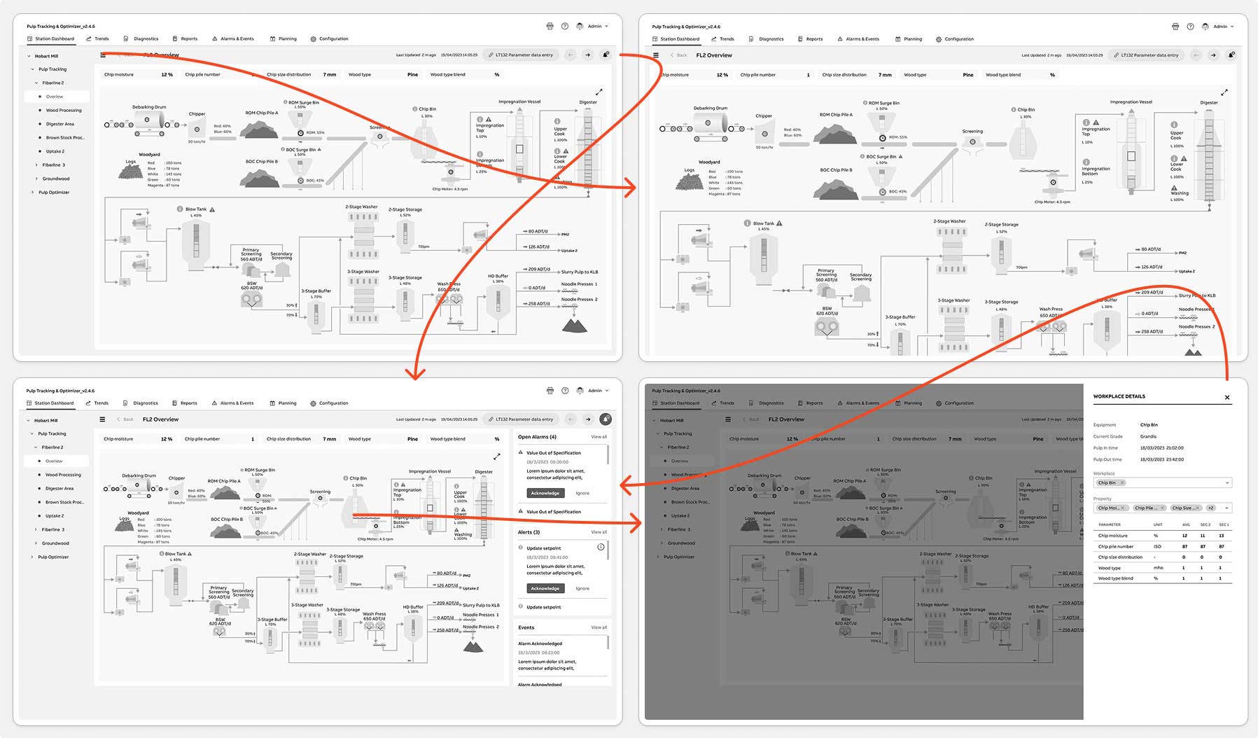
High Fidelity Wireframes/ Mockups
Here are four screens showcasing High-fidelity wireframes.
Features Added
Before finalizing the Pulp Tracking & Optimizer interface, we conducted a round of concept validation tests to verify whether the new workflows would meaningfully improve operator efficiency, alert resolution time, and data-entry accuracy. Although the product had gone through multiple design iterations and engineering sprints, this was the first time end-users-operators, supervisors, and quality analysts-interacted directly with the redesigned concepts.
The goal of this test was to evaluate three core design variations-focused on the dashboard, alert-resolution workflow, and data-entry interactions-to determine which layouts provided the clearest visibility, fastest task completion, and lowest cognitive load. The evaluation centered around two key questions:
To validate this, I conducted moderated usability sessions and remote A/B tests via Zoom with 5–7 end-users across two plant shifts. Each participant walked through realistic task scenarios while comparing two to three interface variations. No formal testing had been done previously on these redesigned screens, though earlier concept feedback from engineering and support teams helped shape the prototypes.
Throughout testing, we also gathered anecdotal insights from production managers, support engineers, and maintenance planners who previewed early versions. Their feedback was especially valuable in refining downtime logging, alert drill-downs, and the handoff experience between operators.
This test marked the second major iteration of the Pulp Tracking layouts-and the first time real operators used the new workflows. Based on the scenarios and insights gathered during the A/B sessions, I made targeted design refinements to improve clarity, reduce friction, and better align the interface with real-world plant conditions.
Viability: To evaluate whether the redesigned Pulp Tracking & Optimizer workflows could realistically fit into fast-paced factory operations, we assessed how well the interface performed under real environmental constraints-noise, time pressure, shared desktops, rugged tablets, and inconsistent network conditions. The goal was to confirm that operators could complete essential tasks without disrupting production flow and that the system reduced reliance on paper logs and manual workarounds. This viability check ensured the solution was practical, durable, and deployable on the shop floor.
Usability: To evaluate whether the redesigned Pulp Tracking & Optimizer workflows could realistically fit into fast-paced factory operations, we assessed how well the interface performed under real environmental constraints-noise, time pressure, shared desktops, rugged tablets, and inconsistent network conditions. The goal was to confirm that operators could complete essential tasks without disrupting production flow and that the system reduced reliance on paper logs and manual workarounds. This viability check ensured the solution was practical, durable, and deployable on the shop floor.
Methodology & ProtocolA lightweight, mixed-methods testing protocol was used to gather actionable insight. This included moderated remote A/B sessions via Zoom, supported by scenario-based tasks and think-aloud observation. Participants included 5–7 operators, supervisors, and one quality analyst across two shifts. Each user performed core workflows such as identifying alerts, entering data, resolving downtime, and navigating station views. We captured task time, navigation behavior, error patterns, and qualitative feedback, supported by anecdotal insights from production managers and support engineers. This protocol provided a strong evidence base for final design refinements.
Final Designs
We incorporated changes based on user feedback received from testing. Here are the updated screens.
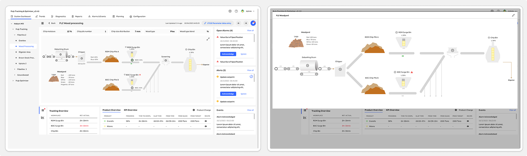
FL2 Overview | Chipbin Details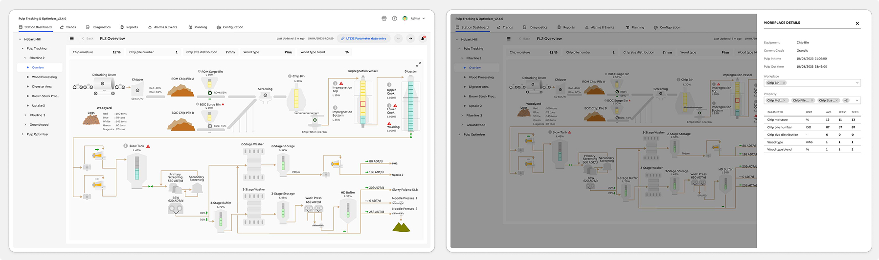
Wood Processing | Wood Processing Expand View
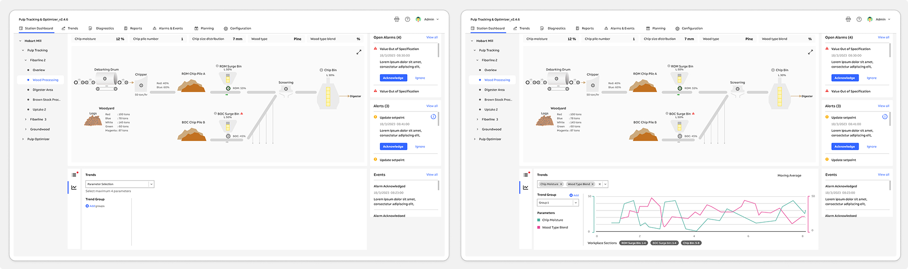
Wood Processing Trends - Add Group | Wood Processing Trend View
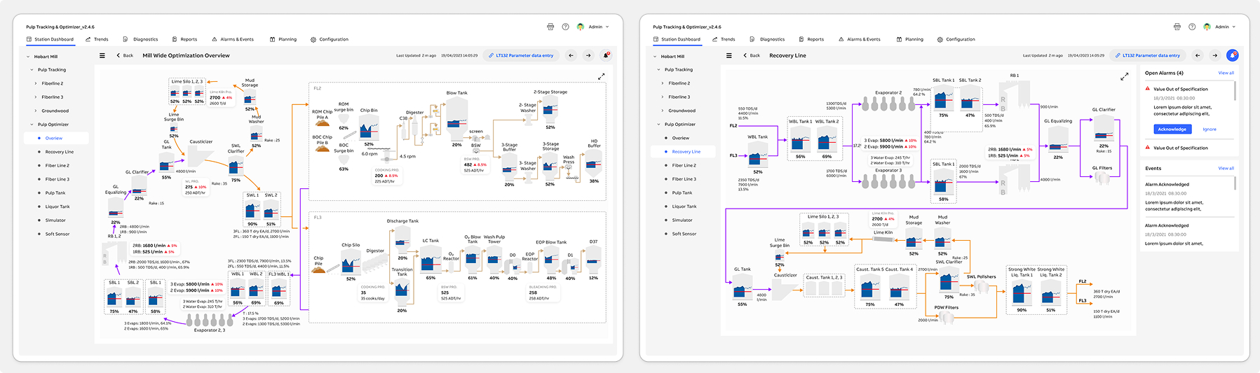
Pulp Optimizer - Mill Wide Optimization Overview | Pulp Optimizer - Recovery Line
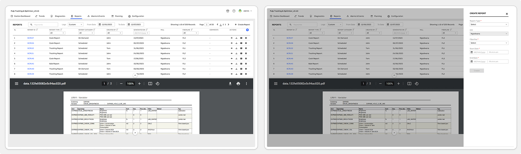
Report | Create Report
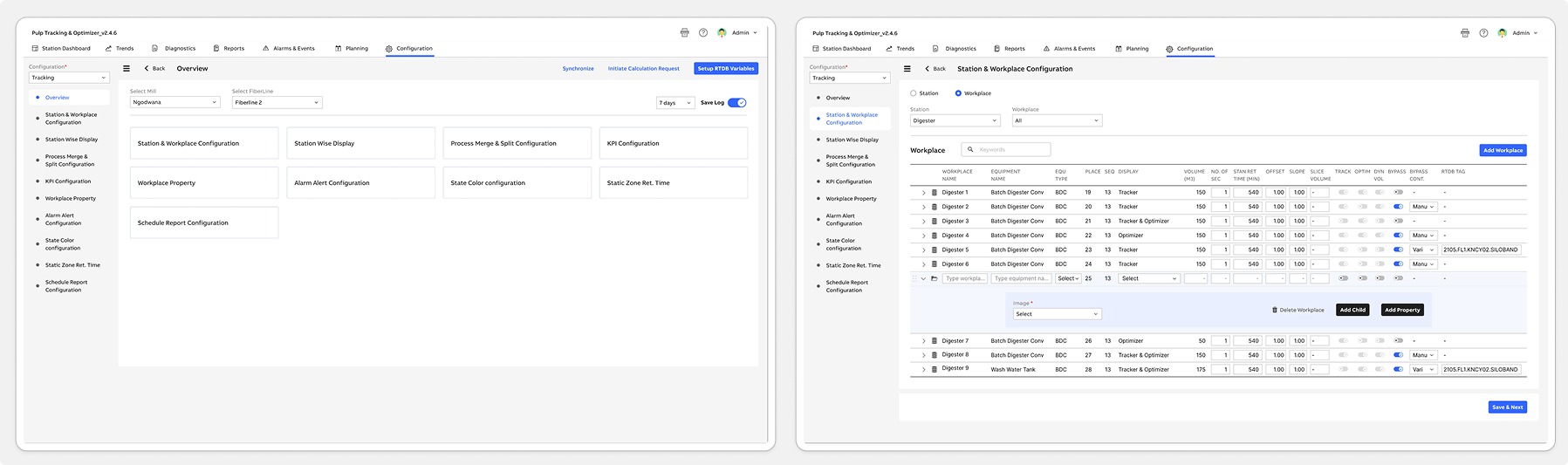
Configuration - Tracking | Station & Workplace Configuration
Following the launch of the Pulp Tracking & Optimizer system, both operators and internal teams quickly adopted the new workflows. Operators appreciated having a faster, clearer way to log readings, resolve alerts, and monitor station performance-significantly reducing their reliance on paper logs and manual spreadsheets. Supervisors reported smoother shift handovers, fewer data-entry errors, and improved visibility into line performance. Meanwhile, internal engineering and support teams were able to redirect time previously spent troubleshooting outdated tools toward higher-value issues.
To understand real usage patterns, we monitored post-release behavior using Pendo analytics. This included feature adoption rates, time-on-task data, and user interaction heatmaps. We also ran in-app polls and multi-choice surveys to gather contextual feedback directly from operators. Additionally, an in-app Resource Center was introduced to centralize help content, provide quick guidance, and streamline continuous feedback collection. Together, these insights validated the new design direction and highlighted opportunities for future optimization.
Increased efficiency: Operators reported a significant improvement in overall workflow speed, with task completion times reduced by nearly 40%. This directly increased shift productivity and minimized delays during high-pressure production cycles.
Enhanced user satisfaction: The simplified and more intuitive UI contributed to a noticeably smoother user experience. Operators and supervisors consistently expressed higher confidence and satisfaction when navigating the new system.
Improved retention: With clearer workflows and reduced cognitive load, both new and experienced operators found it easier to learn, adopt, and continue using the tool-resulting in stronger long-term engagement across teams.
And continuously monitor user feedback and usage data to identify areas for further improvement and innovation.